Cross-Media Experiments: Combining Pastel, Acrylic, and Ink
Why combine media?
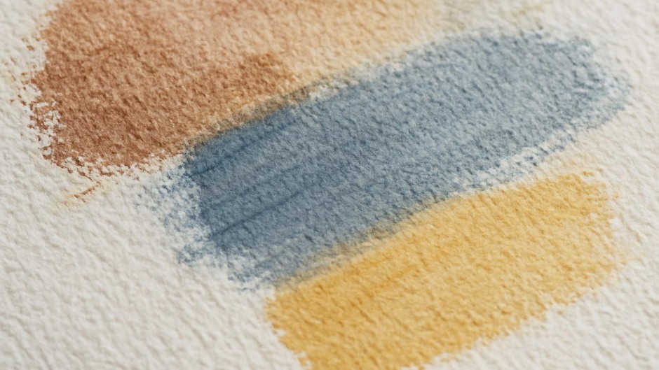
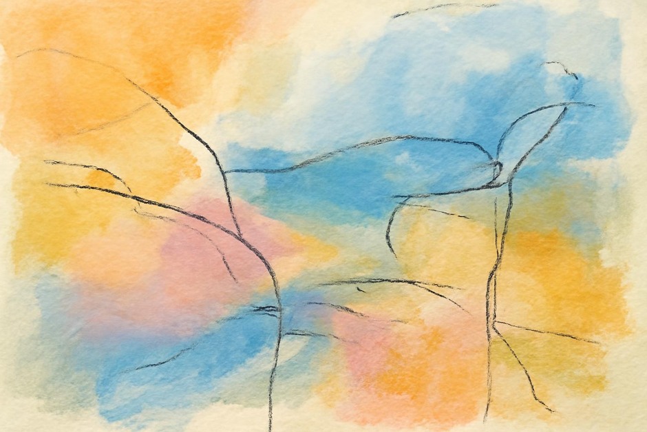
Combining media like pastel, acrylic, and ink offers a broad range of mark qualities and surface effects. Ink can provide sharp linear definition, acrylic offers body and quick drying opaque or transparent areas, and pastel introduces velvety texture and subtle chromatic blends. The challenge is to manage adhesion, layering order, and colour relationships so the combined result appears cohesive rather than patchwork.
Practical rules for ordering
Consider the physical properties of each medium: ink is usually light-bodied and can stain, acrylic forms a flexible film, and pastel sits loosely on the surface. A sensible sequence respects these properties.
- Start with a stable ground: Use a primed paper or board suited to both wet and dry materials.
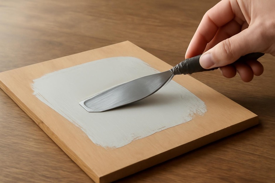
- Apply acrylics early: Acrylic layers can establish large shapes and provide a sealed surface. They dry to a film that accepts ink overlays and, with the right tooth, will hold pastel applied later.
- Use ink for line and detail: Waterproof inks can be layered over acrylic without bleeding. Be cautious with inks that are not lightfast or that may react with acrylic additives.
- Reserve pastel for final passages: Pastel is delicate and benefits from being applied after most wet stages are complete. Fixative may be used judiciously between layers to prevent smudging.
Simple adhesion and interaction tests
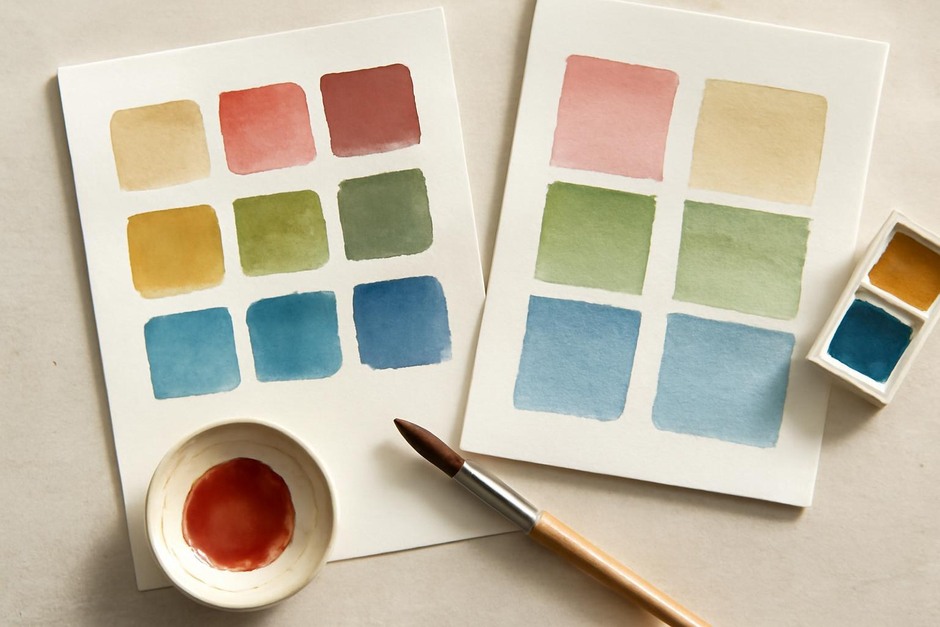
Before committing to a full piece, run quick swatches to test interactions. Prepare three small panels and apply the same sequence: an acrylic wash, an ink line, and pastel overlay, varying a single parameter per panel.
- Panel A: Acrylic underlayer, waterproof ink, pastel over the dry surface.
- Panel B: Acrylic underlayer, non-waterproof ink, pastel over the ink before full evaporation.
- Panel C: Acrylic underlayer treated with a thin isolation coat, waterproof ink, pastel.
Observe smearing, absorption, and colour shifts. Note whether pastel adheres predictably or slides, whether ink sinks into acrylic, and if any of the combinations weaken colour intensity.
Colour unity across media
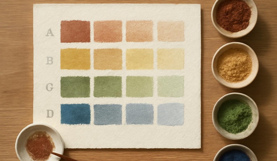
Different media render colour differently due to binder and reflectance. To achieve unity, repeat a small colour note across media: use the same pigment or a visual equivalent in acrylic, ink, and pastel. Establish a common neutral or repeated chromatic accent to tie disparate areas together. Limiting the overall palette simplifies the visual integration.
Fixatives and conservation-minded choices
Fixative stabilises pastel but can alter surface sheen and colour. Apply fixative in light, tested passes and allow full drying between applications. Document any fixative and its application rate on a sample for future reference. For archival considerations, prefer materials with known ageing behaviour and keep a record of media brands and lot numbers when possible.
Observation and iteration
Cross-media work benefits from small, frequent experiments. Maintain a set of annotated swatches and short process notes in your sketchbook. Over time, these records reveal which combinations produce the desired texture, adhesion, and chromatic effects. Thoughtful testing yields confident decisions and reduces surprises while working across media boundaries.