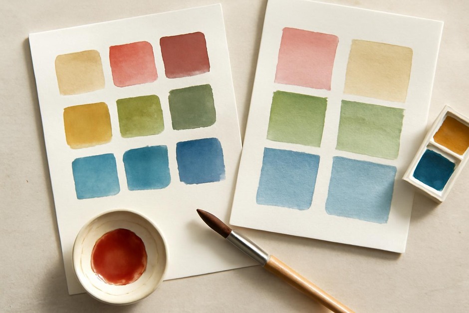
Layering Transparent Watercolour Glazes: Building Depth Without Mud
Principles of transparent glazing
Glazing in watercolour relies on optical mixing: thin, transparent layers allow light to pass and reflect through each layer, creating depth that is different from physically mixed pigments. Success depends on pigment transparency, paper whiteness, the order of application, and drying control. When these factors are considered together, glazing can deepen colour while preserving luminosity rather than producing muddy neutrals.
Choosing pigments for glazing
Select pigments with known transparency. Manufacturers and pigment codes can help, but the most reliable method is a simple transmission test on your paper: paint a narrow strip of the pure pigment and hold it against a light source when dry. Transparent pigments will allow light through, while opaque ones will block it. Use a combination of warm and cool transparent pigments to build rich chromatic layers.
Paper and sizing
A bright, well-sized paper enhances optical mixing by reflecting more light back through the washes. Heavyweight papers resist buckling and allow multiple glazes without distortion. For experiments, use a hand-torn strip of the intended paper and run identical glaze sequences to see how the support responds before committing to a larger piece.
Working sequence and control
- Start light: Begin with the palest values and largest shapes. Glazes are additive; darker pigments applied early can limit subsequent transparency.
- One pigment per layer: Restrict each glaze to a single pigment or a carefully premixed transparent blend. Multiple pigments in one glaze increase the chance of neutralisation.
- Allow full drying: Wait until each layer is fully dry to the touch. Partial drying can lift and contaminate underlying layers.
- Test small areas: Reserve a corner of the sketch for trial glazes to check how a colour will appear when layered.
Common pitfalls and how to avoid them
Many glazing problems arise from pigment choices and impatience. Using opaque pigments or those with high tinting strength in early layers compresses the tonal range and can make subsequent glazes look dim. Similarly, mixing pigments that are close complements in value and saturation can produce desaturation when layered. To avoid this, select pigments with differing hue biases so their combination produces chromatic shifts rather than neutralising each other.
Practical glaze test
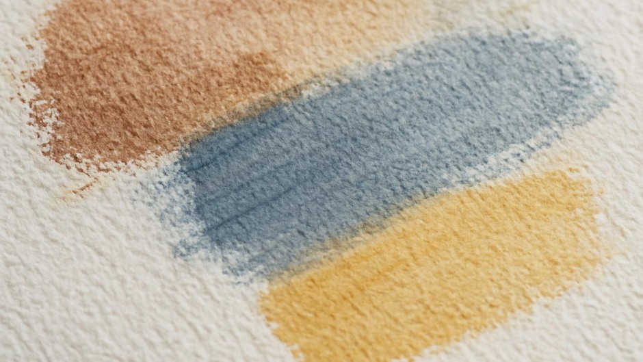
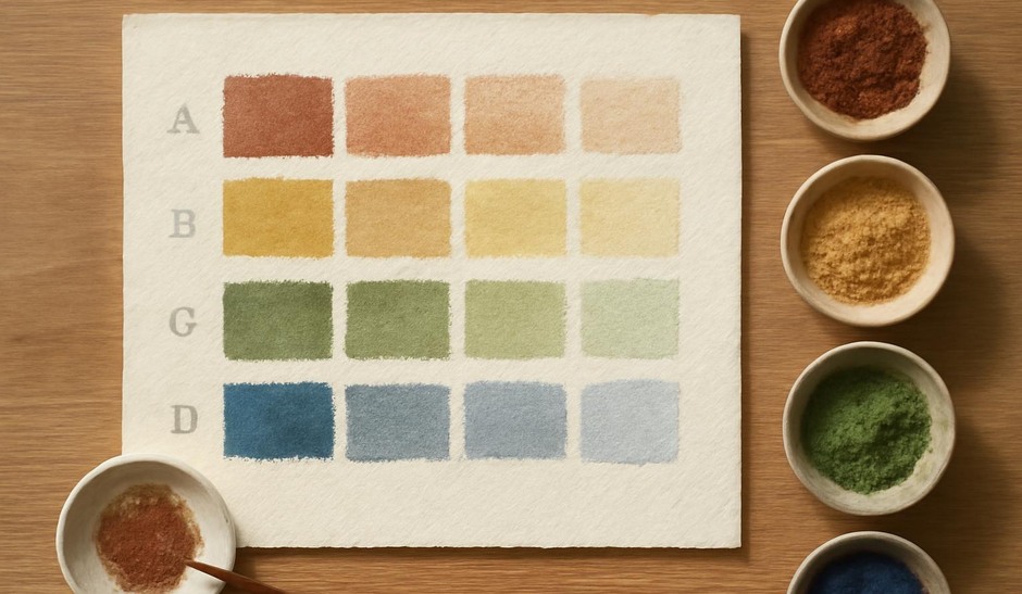
Set up a small grid in your sketchbook with three columns and five rows. In the left column mark a light wash of a warm transparent yellow across rows, in the middle apply a transparent cool blue across rows, and in the right column combine the two with increasing layer counts. Observe how the mixtures change from single glazes to several overlays. Note where chroma remains vibrant and where it begins to lose saturation. Record pigment names and relative dilution.
Observation and adjustment
Glazing rewards patience and careful observation. Over time, small adjustments in dilution, pigment choice, and sequence will lead to a consistent approach that maintains clarity. Keep the tests, keep quiet notes, and let the gradual layering inform compositional decisions rather than forcing colours together impulsively.
Transparent glazing is less a technique and more a disciplined conversation with materials. It offers a way to build depth that retains light and colour when approached with measured experiments and attention to the optical properties of pigments and paper.